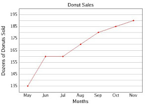
1.How many donuts were sold in July?
160 dozens
2.When were 185 dozen donuts sold? (check all that apply)
October
A line graph shows change over time.
The data is connected by lines, like dot-to-dot or connect-the-dots.
The x-axis (horizontal) usually has the time, increasing from left to right.
The y-axis (vertical) usually has the numbers that measure what is changing over time.

The bear population in the Emerald Forest increased over time.
No comments:
Post a Comment